Today, an effective dashboard is mostly insight-driven. And since a good lot of analysis projects stand upon spatial data, playing with maps is an indispensable skill you need to have in your visualization toolbox.
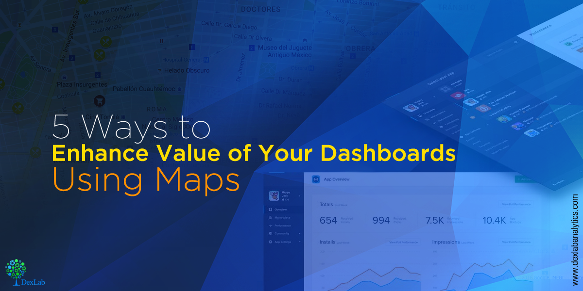
Here, we will like to share a few handy tips to improve the analytic and aesthetic value of maps in your dashboard:
Content is king
To begin with, check if the map you have chosen offers the exact tone of context for your visualization – settle for ‘de-clutter’ style so as to help the readers concentrate on the data, and nothing else.
In Tableau, you will be more than happy to find out three basic map styles – dark, light and normal. They are built in, and are surely an awesome place to start with.
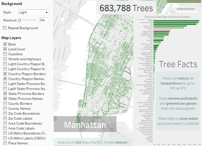
Take a look at these dashboards developed by Tableau maestros – who added a dash of artistic elements to make the maps shine!
To get equipped with the knowledge of Tableau and BI, get enrolled in one of the best Tableau training institutes in Pune..
Let the data talk
A perfect visualization grabs the reader’s focus just on the data, and not the background – meaning, at times it empowers spatial data to speak for itself without a base map.
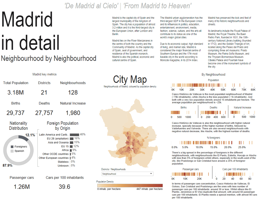
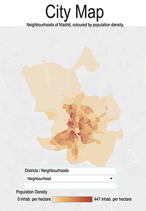
For example, in this dashboard you can see the demographics of Madrid, Spain without a base map. By washing off the fine details, the map becomes clearer and less distracting in design, when fusing the map into the dashboard.
Now, compare this to the same dashboard coupled with a bit of base map content – how does it look? Not too bad, but the original seems more seamless.
Use map as a filter
For better maneuvering through your dashboard, think how maps viz can be used as a filter. Geographic shapes can anytime serve to be the best filters as compared to dropdown lists of text. Not only are they better in providing clear visual cue of the selected region, but also lets people select the surrounding regions of interest for profound exploration.
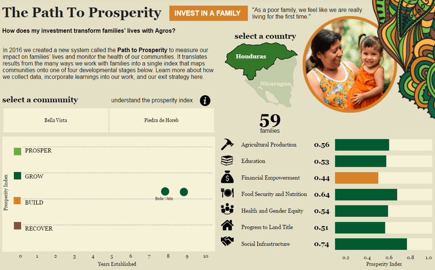
This dashboard prepared by Decisive Data helps you see how giving affects the lives of people living in these 7 villages of Honduras and Nicaragua. It has beautifully used a small map as a filter between two countries – deserves a round of applause!

It’s all in the color
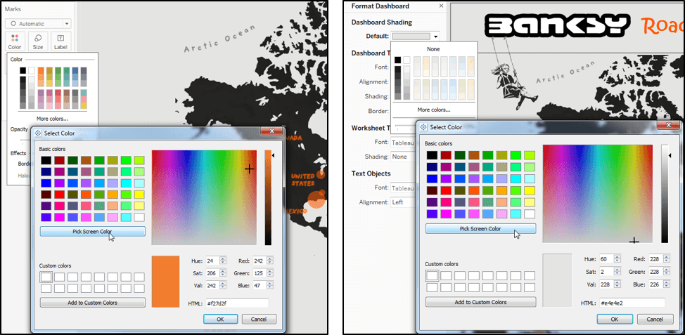
With so many worksheets on a dashboard – it’s time to take advantage of the myriad design tools in Tableau for better integration of map with your design. More so, make sure that the colors for data up on the individual dashboards coordinates with each other.
For seamless integration of map into your dashboard, swear by color picker. The colors should match so as to ensure that maps complement your dashboard’s entire design.
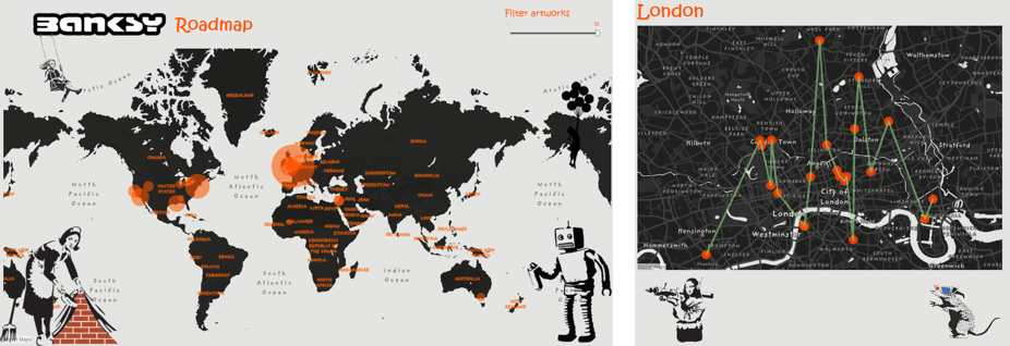
Toy around with shapes
In general, a worksheet is a simple rectangular shape thing displayed on the dashboard – but don’t worry, maps don’t have to be like that. Maps are not limited to a single shape – because geographic features can be of any shape – so try experimenting and amp up your dashboard interface.
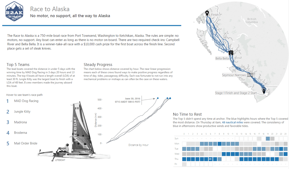
In this data viz, “Race to Alaska”, you will witness great use of a hollow, circular graphic to crop a map to desired custom shape – and of course it’s a greatest of great hack!
Learn more about how to start working with geographic data, marks card and other Tableau related features through Tableau BI training courses in Pune offered by DexLab Analytics. For impressive Tableau certification Pune, look no further.
Interested in a career in Data Analyst?
To learn more about Machine Learning Using Python and Spark – click here.
To learn more about Data Analyst with Advanced excel course – click here.
To learn more about Data Analyst with SAS Course – click here.
To learn more about Data Analyst with R Course – click here.
To learn more about Big Data Course – click here.
Comments are closed here.