As we discussed about the Five Number Summary in the earlier blog post, we will continue to explore the Five Number Summary using Box Plot. Box Plot helps an analyst to identify the distribution of a numeric variable across multiple categorical variables. Box Plot is a graphical representation of data that shows a data set’s lowest value, highest value, median value and the size of the first and third quartile.
In the below example, we are inputting the data into the Base SAS using a simple data step procedure. We are creating a dataset called Turbine that has an average power output on a daily basis.
SAS Code to input the data:
data Turbine;
informat Day date7.;
format Day date5.;
label KWatts=’Average Power Output’;
input Day @;
do i=1 to 10;
input KWatts @;
output;
end;
drop i;
datalines;
05JUL94 3196 3507 4050 3215 3583 3617 3789 3180 3505 3454
05JUL94 3417 3199 3613 3384 3475 3316 3556 3607 3364 3721
06JUL94 3390 3562 3413 3193 3635 3179 3348 3199 3413 3562
06JUL94 3428 3320 3745 3426 3849 3256 3841 3575 3752 3347
07JUL94 3478 3465 3445 3383 3684 3304 3398 3578 3348 3369
07JUL94 3670 3614 3307 3595 3448 3304 3385 3499 3781 3711
08JUL94 3448 3045 3446 3620 3466 3533 3590 3070 3499 3457
08JUL94 3411 3350 3417 3629 3400 3381 3309 3608 3438 3567
;
run;
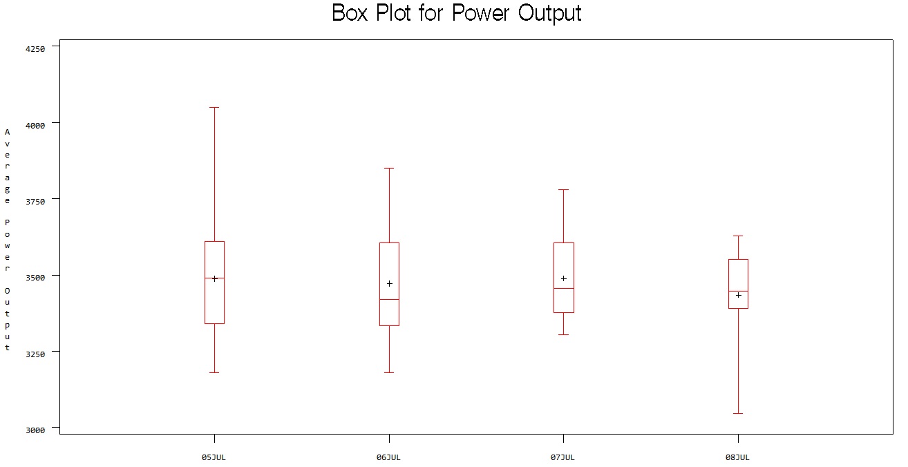
title ‘Box Plot for Power Output’;
proc boxplot data=Turbine;
plot KWatts*Day;
run;
SKEWS in the data:
The Box Plot not only helps you to find the Five Number Summary, you can also find which way the data is skewed.
You can see in the below Box Plot, the data for the day 05July is Right Skewed and the data for 08July is Left Skewed. You can plot a box plot for the sales data across every month in a year. You can find whether any Skewness in you sales data of a month by looking at the Box Plot. This can help you identify the variances and the data distribution for the sales.
The prime importance of using Box Plot and interpretation of data distribution is that Box Plot helps to read the data distribution across multiple series of categories. A single Box Plot can helps you to identify the data distribution rather than looking at single data distribution.
You can create a Box Plot by following the below code in R.
Boxplot(KWatts ~ Day, data=Turbine, main= “Box Plot for Power Output”, xlab = “Average Power Output”, ylab = “Days”)
R software gives lot of functions to play around the Box Plot with different colors. You can explore those options for better interpretation and the visual appealing for presenting your analysis.
Comments are closed here.