
Let us not waste any time on reading long-worded introductions, and get right down to our 5 top tips for creating different map styles in Tableau.
You will be able to find out about these tips and a lot more on Tableau with our Tableau training courses.
Removing map layer:
A simple way to create a clean map for best visualization is by removing the map layers. In order to do this, all you need to do is Select Map on the toolbar menu and “map layer”. Then simply click on the uncheck box and everything in the map layer window, this will leave behind only the outline of the map data.

Image Source: dataplusscience.com
Tableau course details has all these steps and much more to learn about the software, you can know the details by visiting our Tableau training institute website.
Changing the map border colours:
When you use map, you can change the border colours of the map under the option ‘Color’. Simply select the colour and choose the border colour that you desire.
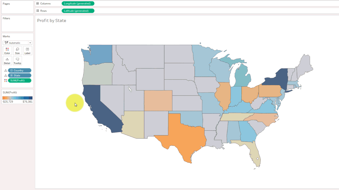
Image Source: dataplusscience.com
Making the USA map outline:
Combining the above mentioned step 1 and 2 and by clicking to remove the fill colour, we can create an outline of a map. To do so, first remove the map layer shown in step 1 and then set the map fill colour to match with the background colour. And voila! After selecting the desirable colour for the borders (as shown in step 2) we now have created just a simple outline of the map of USA!

Image Source: dataplusscience.com
Making a minimalistic map:
To do this in Tableau, you must remove the base layer which is similar as shown in the first step, we can then alter the Pane colour to change the colour of the water on the map to any colour we want. Once we get the base layer to be unchecked, all we have to do is simply right-click on the map and select ‘Format’ then select “Shading” and then alter the “Pane” colour to any shade of our choice.
Creating the countries of the world:
Just like the previously discussed step (step 3) we can start by making the borders of the countries. In this case we have also combined the step 4 where the pane colour has been changed to match. This has given rise to a red coloured outline of the countries of the world on a pitch-black background.
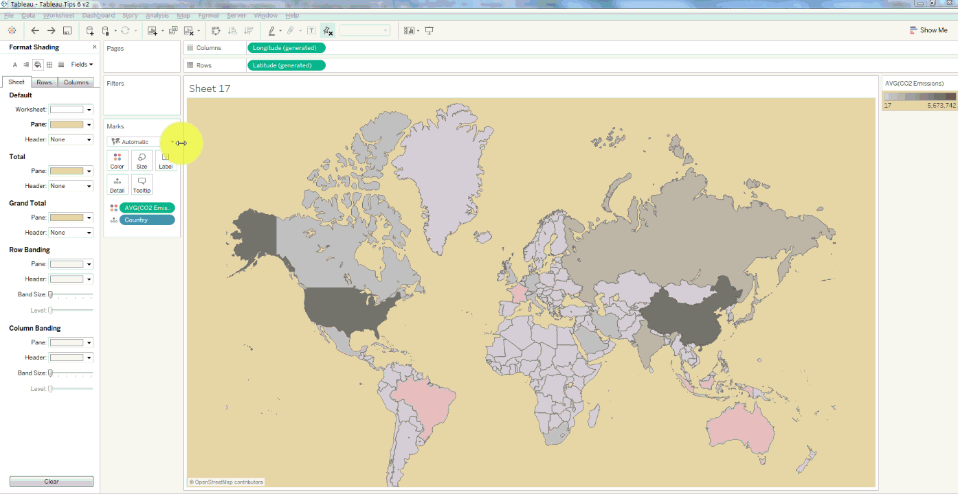
Image Source: dataplusscience.com
For more details on Tableau Certification Training in Gurgaon and which are the prominent Tableau training institutes in Delhi follow our regular uploads on this site.
Interested in a career in Data Analyst?
To learn more about Data Analyst with Advanced excel course – Enrol Now.
To learn more about Data Analyst with R Course – Enrol Now.
To learn more about Big Data Course – Enrol Now.To learn more about Machine Learning Using Python and Spark – Enrol Now.
To learn more about Data Analyst with SAS Course – Enrol Now.
To learn more about Data Analyst with Apache Spark Course – Enrol Now.
To learn more about Data Analyst with Market Risk Analytics and Modelling Course – Enrol Now.
news, online certification, online courses, Tableau BI Certification, tableau certification
Comments are closed here.