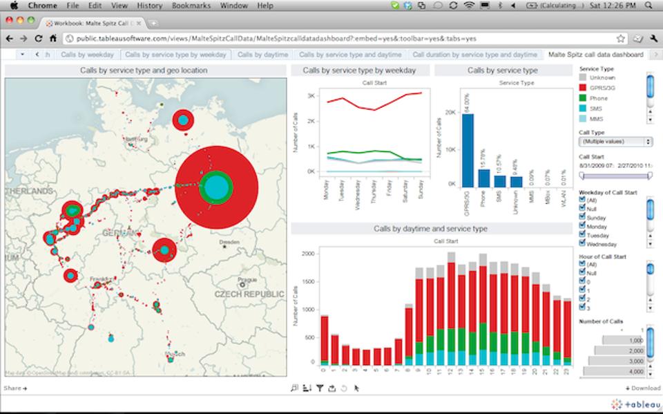
Appalling, bewildering and utterly nonsensical – data at times can look incomprehensible, especially in its raw forms. This accelerated the foundation of the data visualization company and our very own ‘business dashboard’ tool. Generally found locked within the so-called BI sphere, we can now consider these top notch graphical tools as a powerful medium of assimilating, categorizing, analyzing and then presenting data in a highly interactive and interesting form, using images and charts.
What images are used in a BI dashboard?
Typically, we would found scatter plots, bubble charts, heat maps, pie charts, geographical maps and of course standard tables strewn across a BI dashboard– in short, it is a real smorgasbord of visualization tools.
But a question that clogs our minds is – why do we have to use these tools? What purpose they serve? The most prominent underlying reason typically revolves around the fact that we rely more on the computing power to sail through the numbers and then feature those numbers or ‘trends’ that the human mind would have taken ages to comprehend.
From our standpoint, we humans are more comfortable with pictures than tables or numbers. Spotting a trend through visual representation makes things easier and faster as compared to their traditional counterparts.
Infusing some more intelligence
Tableau Software, a Data Visualization specialist is in its endeavour to add intelligence in its existing format by injecting new brain power in the Tableau 10.3 product release.
Expect the following updates:
- Automated table and join recommendations, powered by machine learning algorithms
- Data driven alerts for proactive monitoring of key metrics
- Six new data sources are added for rapid-fire analysis
To make things easier, Tableau excels to help create data dashboard table construction USING machine learning tools – and, trust me it would be quite important as all the machine logs comes mostly from the Internet of Things (IoT).
The mechanism behind data alerts
Powered by latest data-driven alerts, users can now receive instant notifications just the moment their data crosses a pre-determined threshold, ensuring they never miss out the changes occurring within the organisation.
Francois Ajenstat, chief product officer at Tableau stated, “Tableau 10.3 makes it easy for teams to access data, wherever it resides. In all, customers can now connect to more than 75 data sources via 66 connectors, without any programming. That includes a new PDF connector, which allows people to directly import PDF tables into Tableau with just one click. With an Adobe estimated 2.5 trillion PDFs worldwide, this unlocks a new realm of data that can be leveraged for rich analysis.”
New improved Tableau is now equipped with new connectors to data sources, like ServiceNow, MongoDB, Amazon Athena, Dropbox and Microsoft OneDrive.
Is data visualization really a cure-all?
If you ask me, I would say NO, not necessarily. Just by adopting data visualization and BI tools, such as Penataho, SAP, Microsoft, TIBCO and others, it doesn’t mean everything will be good to go. Keep in mind, though the algorithms are gaining momentum and becoming super powerful, we humans are still better in identifying the nuances, quirks, outliers and absolutely unique one-offs.
As parting thoughts, Tableau is marvellous, but don’t forget your fundamental commands in mathematics, learnt at school. They’ll help you, for sure! Till then, wish you luck!
For Tableau training courses, rest your trust on DexLab Analytics. We are a reputable Tableau Training Institute, headquartered in Gurgaon, with a branch in Delhi.
Interested in a career in Data Analyst?
To learn more about Data Analyst with Advanced excel course – Enrol Now.
To learn more about Data Analyst with R Course – Enrol Now.
To learn more about Big Data Course – Enrol Now.To learn more about Machine Learning Using Python and Spark – Enrol Now.
To learn more about Data Analyst with SAS Course – Enrol Now.
To learn more about Data Analyst with Apache Spark Course – Enrol Now.
To learn more about Data Analyst with Market Risk Analytics and Modelling Course – Enrol Now.


Comments are closed here.